A review and comparison of the following three decks:
The Oswald Wirth Tarot by U.S. Games
The Golden Wirth Tarot Grand Trumps by Lo Scarabeo/Llewellyn
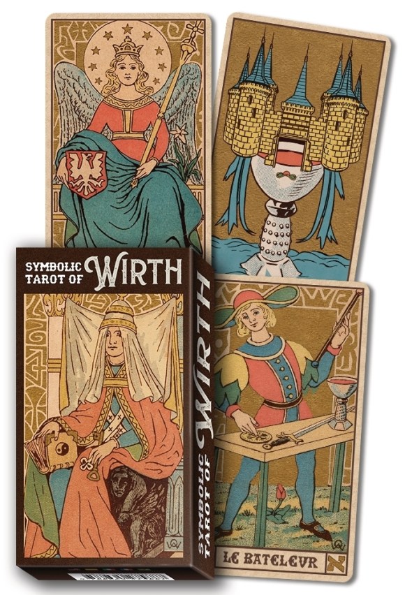
The Symbolic Tarot of Wirth by Lo Scarabeo/Llewellyn
I feel confident in that fact that I am not the only tarot enthusiast who ever said, “Oh, if only someone else would create a deck that consisted of fill in the blank, that would be the perfect deck!” All of us are on the hunt for the perfect deck. This pursuit of perfection seems to be the goal of the entire species ever since we started inventing stories about a lost Golden Age, that period of primeval greatness from which we have fallen and to which we strive even now. Of course, the key elements of my earlier wishful phrase are “someone else,” since whatever artistic skills I may have had in my youth have certainly languished in the intervening decades, and “fill in the blank” because each person has an ideal structure, theme, or personal mythology that no one else has. I would love to direct an eager and talented Pamela Colman Smith or beleaguer a brilliant and beset Frieda Harris, but at the moment, I don’t see that happening. And my demands are paltry compared to a Waite or—God forbid—a Crowley. I say all this to somehow justify the lengthy whine that follows. I feel so terribly guilty criticizing the work of someone upon whose product I cannot improve. Is it not the pinnacle of hypocrisy to simply point out perceived faults rather than offering then the solution to those faults? Am I bringing the same venom to tarot that I do to education, religion, and politics? I will have to monitor myself as time passes to make sure I don’t fall into any old-man bitterness traps, and here we go.
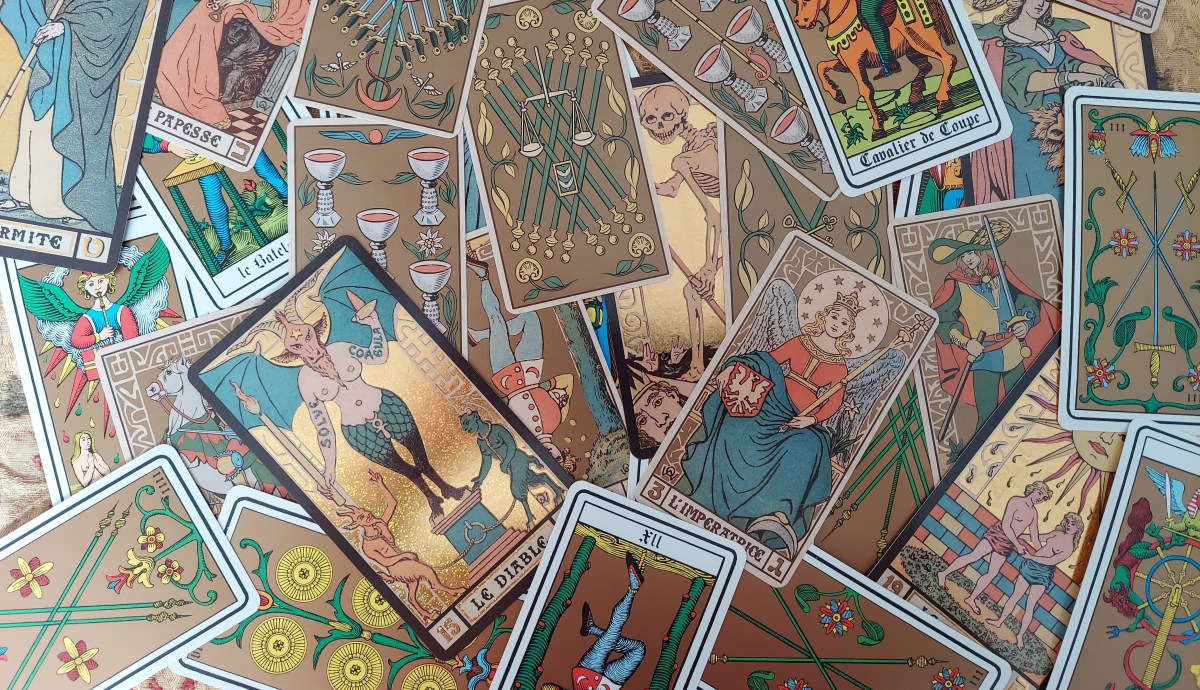
Ever since I first started working with tarot, a few classic decks have always merited attention: the RWS to be sure, Crowley’s Thoth, a pretty Marseille, and the decks created by Oswald Wirth. Especially with regard to the mature 1920s version of the cards, I have always enjoyed their bold graphic nature. The cards are simply aesthetic in every sense from the linework and background designs to the coloring and elegant expressiveness of the illustrated faces. However, I have always read with a fuller deck. The argument has rightly been made that the “tarot” consists of the twenty-two trump images and that the tarot was then grafted onto a four-suited deck of playing cards, creating the most common form of the deck of cards now called “tarot.” So be it, but I still prefer to use a deck of around 78 cards, and it has forever pained me that Oswald Wirth never attempted the courts and pips of the four other suits.
Generally speaking, three very common versions of Wirth’s images predominate: 1) the trumps he created in 1889; 2) the trumps he created in 1926; and (3) a new “interpretation” of the images created by the French artist Michel Simeon in 1966. Over the years, many versions of the Oswald Wirth tarot have popped up, some from mainstream publishers, some from independent marketers, but the other four suits have always been the issue for me. As far as easily getting a facsimile of the cards, Red Wheel/Weiser’s newest iteration of Wirth’s book Tarot of the Magicians (an interesting translation of the original Le Tarot des Imagiers du Moyen Age) has a removeable version of the 1889 deck included as an appendix in the book itself. The cards themselves are a bit small, but if you are good with scissors, those twenty-two cards can be yours. I know I wouldn’t use them, and my bibliophile’s heart won’t allow me to take the required pages out of the book and scissor them up, so within the book they remain. As far as Wirth’s system for categorizing, defining, and analogizing the cards, I am still making my way through the book and his process.
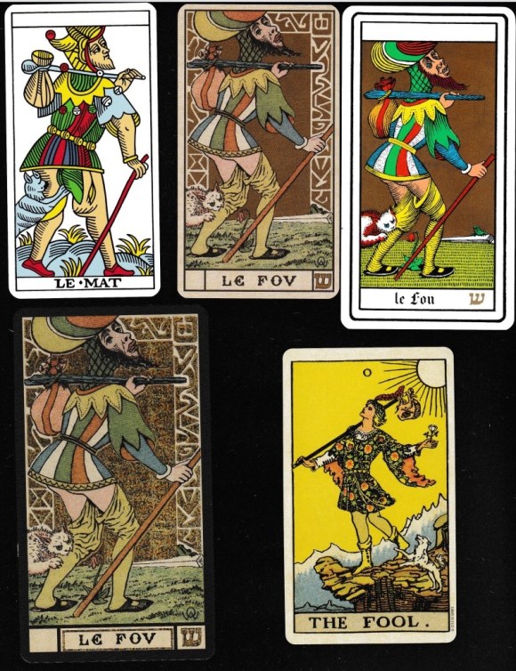
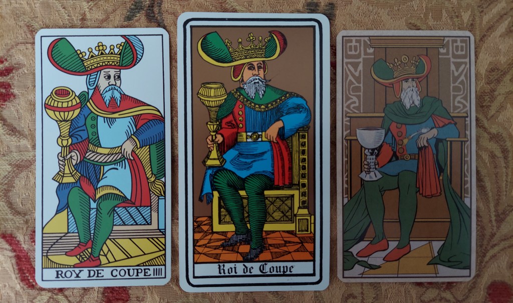
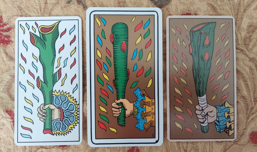
The only version of the Oswald Wirth tarot that was available for years was the U.S.Games version: “The Original and Only Authorized” Oswald Wirth Tarot. It was one of the first five or six decks I ever owned, and I ordered it from the U.S. Games catalog some decades ago. I was astonished at the time how terribly unattractive it was…excuse me, “is.” Nostalgia allows me to forgive only so much. The deck uses Michel Siméon’s stylized, high-contrast black-and-white mid-sixties interpretations of Wirth’s 1926 Trumps, and it would appear that U.S. Games hired an “artist” who then attempted to complete the deck with a Marseille-based system of minors. While the Siméon images are actually a serviceable substitute for Wirth’s original trumps, save for some questionable printing quality that one must lay at the feet of U.S. Games, the courts and pips are quite dreadful. Line quality and weight is non-existent, and the court cards have an awkward, haphazard feel. Equally with regard to the pips, no effort was made toward consistency with the trumps, so we have wands, swords, cups, and coins that are strangers stylistically to the deck as a whole. Additionally, with an eye toward a faux-Marseille style, the cups and coins seem to be a repeated image while the swords and wands—and all the floral superfluities that make or break the charm of the Marseille—look more like inked drawings, lacking even a modicum of smooth mechanical finesse.
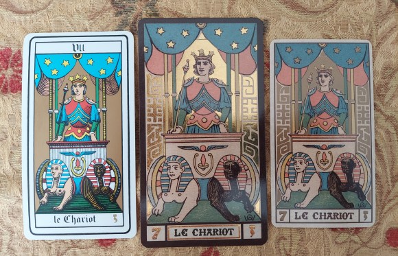
They are not entirely terrible—I have used them for years. Years ago, when I still used reversals, I even took the time to add an inconsequential black notch in the bottom right corner of the pips (which you can see in the pictures) so that I could discern the orientation of the card. The gold ink that dominates the cards from The Fool on through is warm and comforting and gives some unity to an otherwise slipshod production. And for some reason that I am unable to fathom, I love the peculiar size of the cards. Standard tarot cards, that is, the standard RWS size, measure 70mm by 120mm; the 1976 Wirth by U.S. Games is just as wide at 70 mm, but the cards are given a longer, narrower feel with their 132mm length. Alas, nostalgia does play its part. The backs of the cards are as electric and visual as 1976 was, which may not exactly be a compliment. These cards are some of my oldest and one of the first decks I used when I was just beginning to learn about this art, so with me they shall remain, a legacy.
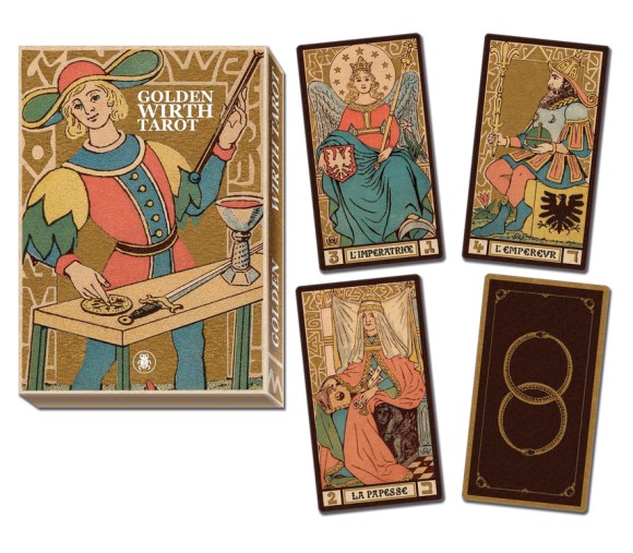
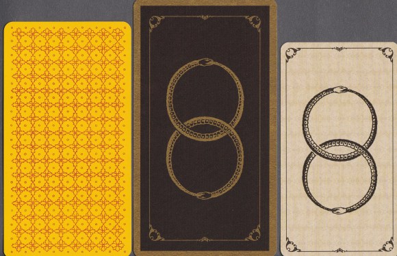
I don’t know why U.S. Games has not stepped up their Wirth game. They could absolutely keep the Simeon majors and retool the minors, and I would buy it again and again. This only occurs to me because Lo Scarabeo released the Golden Wirth Tarot Grand Trumps in 2015. These cards, using the original 1926 Wirth images, are simply lovely. Sadly, the deck is Majors only, but the images that I saw online appeared to be embossed with the gold foil of which I am fond, so I got them. The cards themselves are pleasingly large at 80mm wide by 145mm tall. They are handsome cards, bordered in brown with an elegant and appropriate double ouroboros design on the backs. While I love the size of the cards, however, they do feel quite thin, certainly thinner than some other Lo Scarabeo releases, almost as if they tried to recoup some of the cost of the cards’ size and metallic embellishments by skimping on card stock. Of course, I got them to look at rather than use, so that’s fine for me, but be aware. Also, the gold foil about which I was so excited is…odd. At one angle, they are stunning, but from every other angle, the gold foil has a strange and unattractive “glittery” appearance. Of course, I expect Lo Scarabeo to have medieval monks hammer out gold leaf and apply that to the cards while chanting prayers in Latin. Perhaps those expectations are unrealistic for $25.00, but I wish they had aimed a little higher than the fancy iron-on-craft-store-metallic-glitter-paper feel. Given the Ethereal Tarot of U.S. Games or even the beautiful Art Nouveau Tarot that Lo Scarabeo itself released, I don’t feel unrealistic in expecting that level of printing quality for a deck of only twenty-two cards. These complaints are why I feel like a spoiled five-year-old child. When I look around the world, this is what I take the time to complain about? Willy Wonka would have offed me in some catchy musical number. Still hope flared again when Lo Scarabeo introduced The Symbolic Tarot of Wirth.
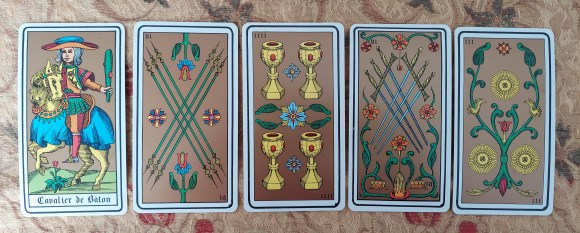
Printed in December of 2020 and released in the U.S. around June 2021, I had only really seen the pictures on Llewellyn’s website. I searched for more images, but they were not overly forthcoming. Lo Scarabeo used the fantastic Wirth trumps from 1926 and artists Mirko Negri and Bruno Letizia created a series of minors to accompany them. I had hoped that they would be unillustrated pips as Wirth created his trumps based on the tarot de Marseille. When I saw the five of batons on Llewellyn’s website, I assumed that they had performed their task. The artwork looked great. In this early part of the twenty-first century, I assumed that it would be very easy to digitally remove parts of the Wirth trumps to use in the other cards, and essentially, Le Bateleur (The Magician) is holding all the suit symbols as Wirth envisioned them. One need only artistically recreate the suit symbols as they appear on that card, maybe embellish a card or two with other objects in the Trumps, perhaps the staff carried by the Emperor could show up in the baton suit or the sword carried by Justice finds its way into the sword cards. This is where I thought Lo Scarabeo was headed because it only made sense.
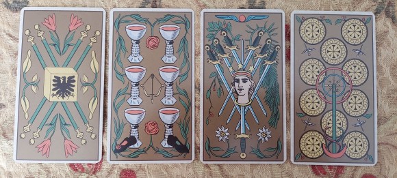
The cards arrived. They are lovely. The card stock is nice; the backs are a differently colored version of the double-ouroboros used in the Golden Wirth. They are perhaps a bit smaller than I wanted at 66 mm by 120 mm, but this is not a complaint, only an observation, and after some use, I appreciate the size. They are standard tarot length, but a bit narrow to accommodate the proportions of the original Wirth images. The minors are essentially the Marseille-inspired style using the emblems found on the Magician’s table. They use the limited palette of the original and the gold background throughout for an added sense of unity, and this is nice since it distracts from the differing styles of art and linework that inevitably crop up in a project like this. The minors, all of them, are obviously computer-created images. Again, this is not a complaint. Kudos to Lo Scarabeo. The decorative Wirth border that surrounds the Fool is even used to consolidate the Courts as part of this Wirth family, and they too are very much based on the Marseille standard. Mirko Negri and Bruno Letizia are to be commended for their project to that point.
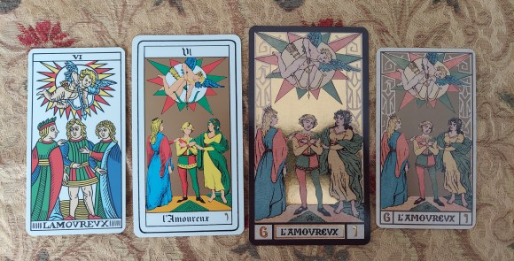
And then, I slowly shake my head and mumble to myself, “You only had one job.” For you see, Lo Scarabeo’s editors decided that Wirth’s tarot needed some kind of ridiculous “system” imposed upon it. “Oh, but this is Wirth’s system.” OK, but here is why that argument doesn’t matter. First, do we really know that Wirth intended this system to be imposed on the minors? And second, these additions are useless and ugly. Just, period. As with any new deck, I am going to look at the cards first before I look at the Little White Book, so as I was looking through my new Symbolic Wirth, I saw the little Magician’s hat on the club that is the ace of batons, and I thought, “Oh, that’s cute. They’re using some of Wirth’s symbols throughout the deck.” Then on the two of batons, we see the two keys held by the Popess. Three, the Empress’s shield. Four, the cubic throne of the Emperor. Five, the papal staff and benedictive hand of the Pope. Oh, a pattern. As I quickly looked through the rest of the minors, I was horrified to discover that they did indeed impose this pattern on every single minor card. Every Ace has the Magician’s hat on it. Every two, the keys, and so on. And honestly, it doesn’t become problematic for me until the six. We find Cupid’s bow and arrow and the ridiculous mismatched shoes of the Lover hovering there on every six. The Charioteer’s head is just plopped on every seven. The eights, Justice’s scales; the nines, the Hermit’s lantern and snakes; and the ten, the pièce de résistance, the entire wheel of fortune itself from Hermetic bottom to big round top. And they carry this silly practice all the way through the courts, though the additions are thankfully not as obvious—except perhaps for the urns of Temperance on every king.
I’m sorry. Again, I shouldn’t complain. I am sure that some people are thrilled with these additions. I can’t imagine why, but “different strokes for different folks,” “à chacun son goût.” People go hungry, and I am fixated on what I consider a poor publishing decision on tarot cards. But I think my personal disappointment in these cards is that they were so close, so close to what I wanted.
In any case, the Wirth images are some of the best classic tarot images that exist: the 1889 images are simple and profound; the 1926 images are an elegant elaboration on those original trumps; and the 1966 images are fascinating in their own right. Happily or sadly, I feel that we are still about three good printings or editions of the cards before we hit my emotional pay dirt, but we are getting there. I can’t imagine that Wirth ever thought his name would be so highly regarded in the early twenty-first century, so for all my complaints and pointless whines, I am still extraordinarily grateful to U.S. Games and Lo Scarabeo for remembering and honoring these classic images.

6 replies on “Hope Springs Eternal: The Evolution of Mass-Market Oswald Wirth Tarots”
I am having so much fun reading your blog! What an intelligent and perceptive voice you bring to various tarot subjects. I came here for Oswald Wirth and am staying to read them all. Excellent!
LikeLike
Thank you for your kind words! I really appreciate the feedback. –Robby
LikeLike
Do any of these Wirth decks have minor arcana interpretations in the LWB?
LikeLiked by 1 person
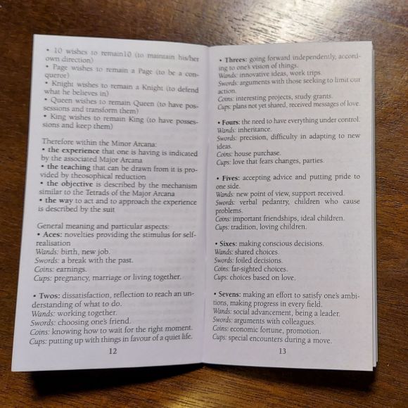
Hi, Roger. The Oswald Wirth from U.S. Games includes their standard LWB with keywords for all 78 cards. The Golden Wirth is a Majors Only deck, so their book includes only trump descriptions, but the Symbolic Tarot of Wirth does have a booklet that is rather extensive given what it is. That booklet does include keywords for the lesser arcana, but that booklet also includes a lot of “we tried really hard to make this a Wirth-based system” so I find that booklet a bit tiresome since I don’t use a “Wirth-based system,” but I will be addressing that soon in a new review. I will amend the post above to include a picture of a page from the Symbolic Tarot of Wirth. Thanks for reading! Robby
LikeLike
Loved your coments and great sense of humor! Most of all, because you said what I was founding corage to think.
Sorry my English, It´s not my first language.
I´ll read your entire blog now and I hope to have many good laughs like I have on this post. Lots of sucess for you!
LikeLike
Thank you! I am glad you liked it!
LikeLike