Publisher: Patrick Valenza at Deviant Moon Inc.
Website: http://www.deviantmoon.com
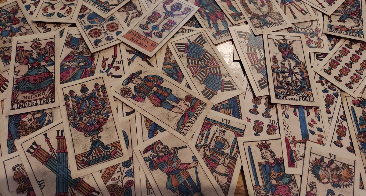
Ever since I first laid eyes on images of an Edoardo Dotti Tarot, I have wanted a deck of those cards. In that first exposure, on page 160 of Stuart Kaplan’s Encyclopedia of Tarot, volume 1, I fell in love at first sight. I don’t know why. At the time, now decades ago, I didn’t read with pips, and I had no real clue about either tarot history or publishing history. The answer must then lie in the fact that I was an art major at the time. Ahhh, the beautiful carefree days of youth and yore.
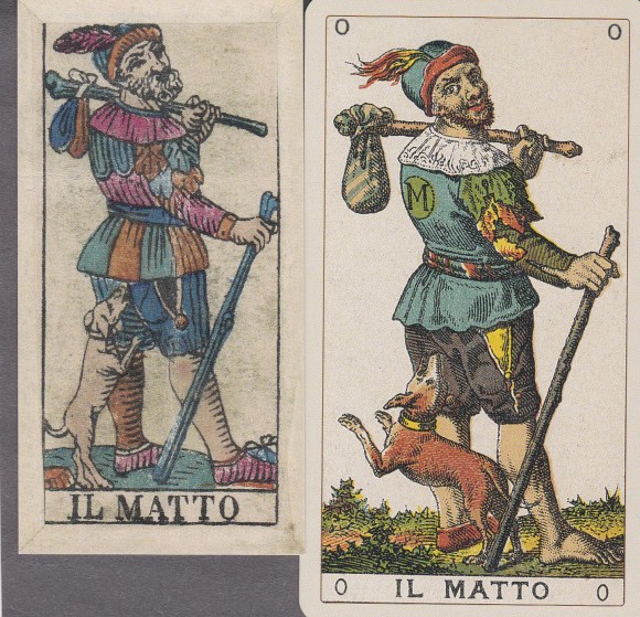
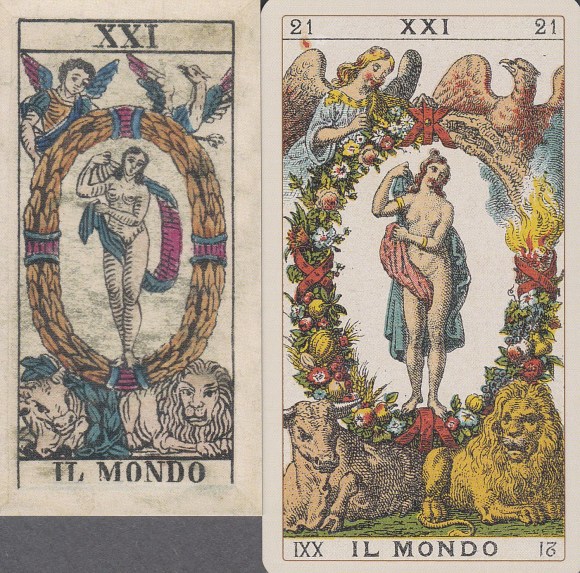
From the stylized work of Aubrey Beardsley and E.M. Lillian to the subtler pen of William Pogany to the flirty, vibrant work of Charles Dana Gibson, and more recently, the bold carnality of Fyodor Pavlov, exquisite line work, whether with pen and ink, brush, or woodcut, stands as a class all its own. The mid-nineteenth-century woodcut images that I saw in the encyclopedia had that same masterful organization and weight; they had an elegant simplicity that I adore. But for the last thirty years, no one seemed interested in reproducing an Edoardo Dotti from the 1860s. Until now.
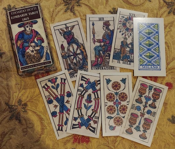
Patrick Valenza, already a greatly respected artist and creator of U.S. Games’ best-selling Deviant Moon Tarot, has procured a Dotti from 1865 and subsequently printed a facsimile edition of the deck he owns. As Valenza seems to be a collector of antique decks, this appears to be the fourth or fifth time that he has obtained and reprinted historical decks, and now that I know this, I intend to make his efforts profitable. (I see a Besançon on his website that I will own…)
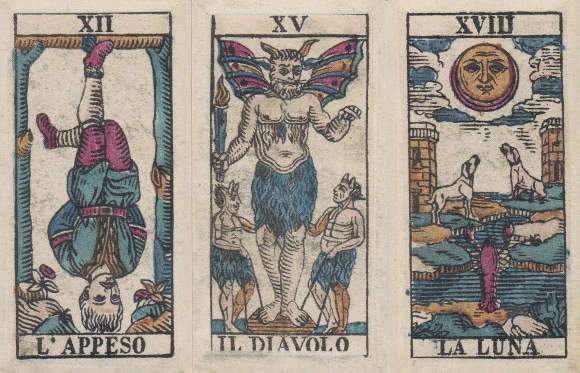
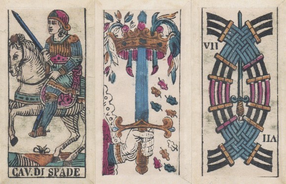
As for the details of the printing, I assume that the deck is the same size as the original; the cards measure approximately 54 mm wide by 116 mm tall, so they are smaller than a modern tarot, but still a “handy,” usable size. The cardstock appears slightly thinner than standard Lo Scarabeo or U.S. Games stock, but still nice. They have the semi-gloss sheen of a new printing to them, but are not shiny, which is great. Also, to preserve the integrity of the reproduction, Valenza has kept the folded paper aspect of the front of the cards and the square, unrounded corners. The original cards were printed on the front, but the backs appear to have been applied and folded over the edges of the fronts. Sometimes the folds move slightly into the images, but as this only maintains the historicity of the document, I find no problem here.
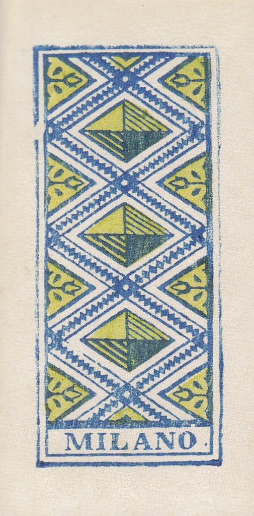
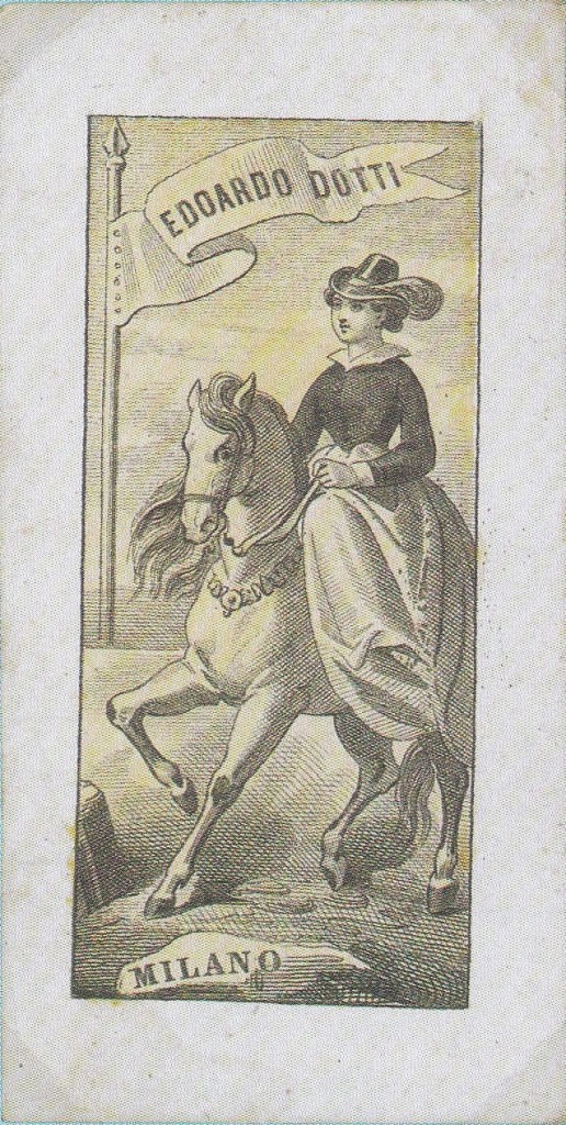
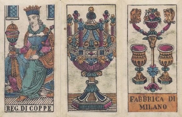
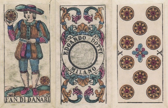
The backs of the cards are a lovely geometric print with “Milano” printed proudly at the bottom. This would appear to be an innovation of the 1865 edition, as the 1862 version was backed with a picture of a woman on horseback carrying a flag. I much prefer the back that Valenza has printed as it is simpler and more uniform than the busier 1862 image.
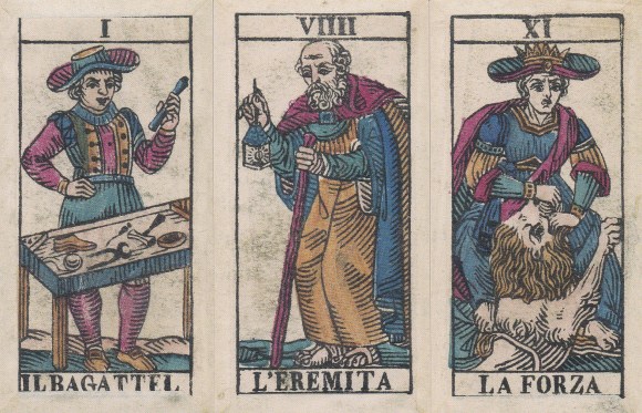
Additionally, I now see why the composition of the images always appealed to me. In addition to the quality linework that I have already mentioned, Dotti’s images (and other Milanese tarots of the time) are based directly on what I consider to be one of the absolute pinnacles of printing in general and tarot card printing specifically, the Italian “sopraffino” tarot. These particular Dotti tarots would appear to be the poor man’s answer to “i tarocchi sopraffini” or “super-fine tarots” of the same region, which began being produced in Milan, the capital of the Lombardy region of Italy, some thirty years prior. As their name suggests, the sopraffini tarots were exquisitely crafted by some of the finest engravers and printers of the day, and I enjoy reading with them to this day. In addition to Dotti’s sopraffini tarots, two names associated with this particular Milanese tradition are Carlo Dellarocca, who began producing sopraffini tarots around 1835 and later i fratelli Avondo, the Avondo Brothers, printed by Cartiera Italiana Serravalle-Sesia.

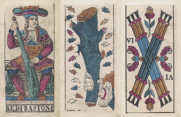
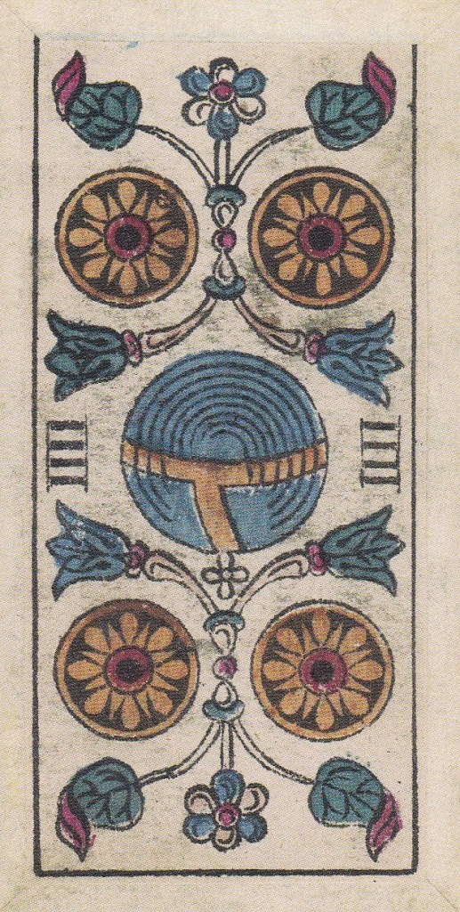
I am simply thrilled to have this deck to use, and use it I will. Are there any drawbacks, you may ask, to this new addition by Mr. Valenza? Well…maybe, maybe not. Without access to the original deck in Mr. Valenza’s possession, I do not know for certain, but it would appear that the three, four, and seven of coins have been printed upside down. The three and seven are certainly up for grabs. The arrangement of the three and seven coins would make no real difference to me. In other Dotti decks and even in the contemporary Swiss decks, the three coins were generally arranged two on the top with one underneath; while in the seven, the coins are generally arranged in four rows going from top to bottom, two, two, one, two. In this printing of the deck, the three of coins has one coin above and two below, and the seven has rows of two, one, two, two. Honestly, upside down or not, I prefer the bottom-heavy version to the top-heavy version; however, as I looked at the four, the card is noticeably reversed. The heraldic globus cruciger in the middle of the card is upside down. The cross that signifies Christ’s (and the king’s or emperor’s) dominion over the earth should rightly be on top of the orb. Aside from this tiny (and honestly questionable) blemish, these cards are a wonderful and welcome addition to my collection of usable historical reproductions. And for as long as I have pined for a useable Dotti, I am beyond happy to have this deck. The love I had at first sight has only been confirmed by a good second look.
Thank you, Mr. Valenza, for your continued contribution to the world of tarot!
Again, if you would like to purchase this deck before the limited printing is sold out, head to Patrick Valenza’s website www.deviantmoon.com. Tell him the King sent you!
